I'm an Xbox fan and love halo.
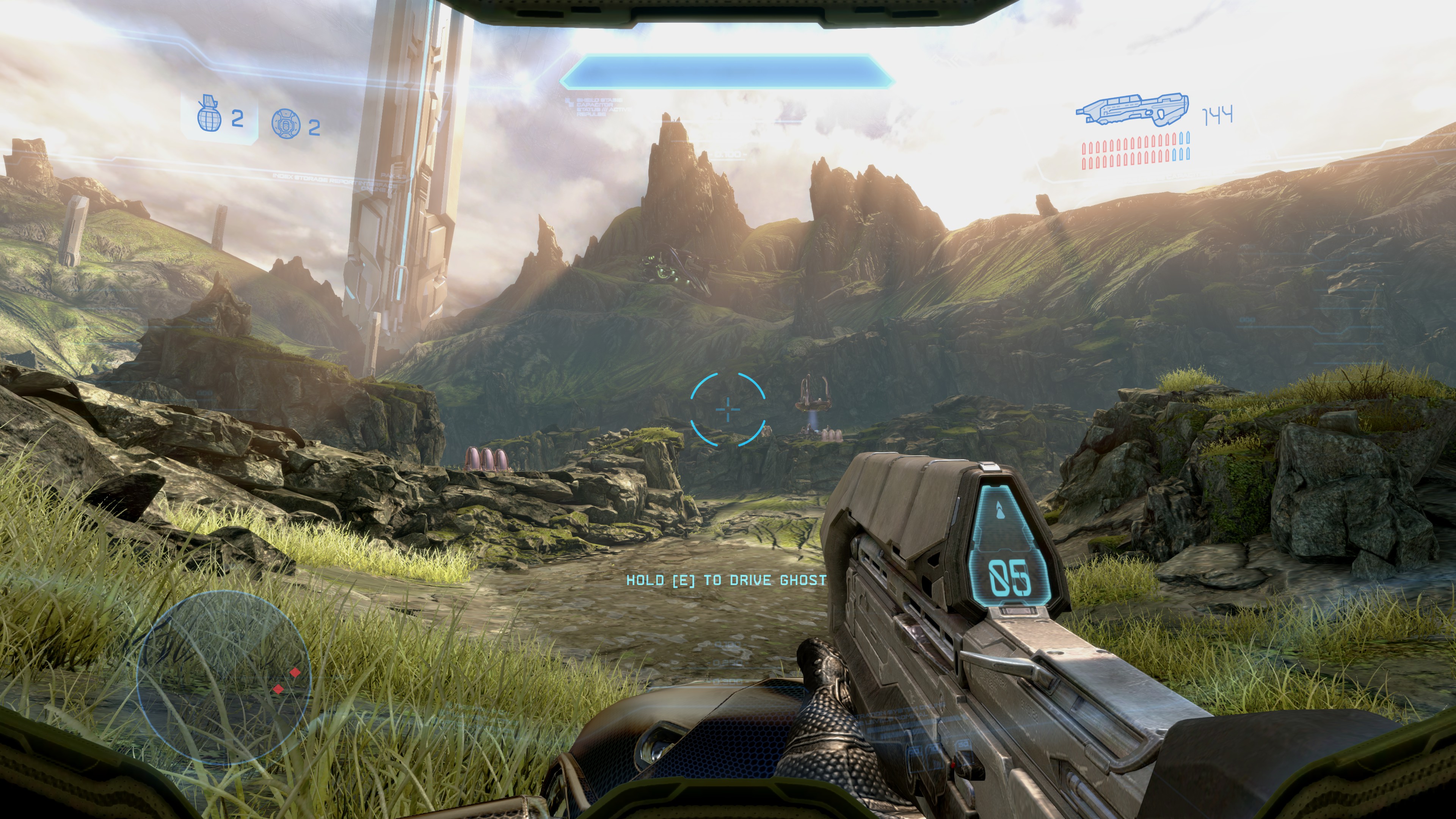
I think all the screenshots looked great....
Up until I closely examined them - has anyone else noticed the amount of conceptual chalk art/What seems to be conceptual art overlaying/blending into some of the screenshots shown?
Anyone?
There isn't a consistency across images and in particular, the needle on the pine trees - some look chalked in, or mixed atop a conceptual art overlay... but others are highly detailed.
In one image, when looking at the tree line, then gazing towards the cliffs to the right - the conceptual art seems to be blended into the cliffside as well, and in some parts you see highly detailed textures.
It's as if the texture artist is plucking textures from concept art, drawn from conceptual chalk/thickly brushed concept art pieces... and meshing it together with the actual game assets.
Some of the trees in the distance, nay - many... are atrocious, awful and look as if they've been mixed/photoshopped with even worse conceptual art pieces.
I'm pro Xbox, a fan of good graphics too however - and I've seen far better on last gen - so I know Halo is capable of looking far better but for now
what gives with handing gamers photo's seemingly utilizing a blend of conceptual painted art overlaid atop and blended into actual in game screenshots.
Or perhaps they are just plainly using conceptual art for most texture derivatives. Which would be a jarring way to communicate Halo is going to use a mixed art style and filters across assets.
Visual Issues that I as a fan of both Xbox, and Halo... (and next gen graphics) have taken the time to highlight
However I do realize the game has essentially been 'restarted' I think a lot of these issues in fact communicate a partially mixed artstyle, and we haven't heard otherwise.
You guys have zero standards.