Redneckerz
Those long posts don't cover that red neck boy
There are different ways to close your account, Magaman.Reminder: Halo 4.You guys have zero standards.
There are different ways to close your account, Magaman.Reminder: Halo 4.
Game that isn’t out for another 8 months or so isn’t finished?kinda looks unfinished?


It looks exactly the same???? (Jk! Looking a wee bit better!)Big win if you ask me from what we saw last year - from February's Inside Infinite update focusing on the world of Halo Infinite/Zeta Halo and Design, so mostly environmental stuff. - https://www.halowaypoint.com/en-us/news/inside-infinite-february-202.
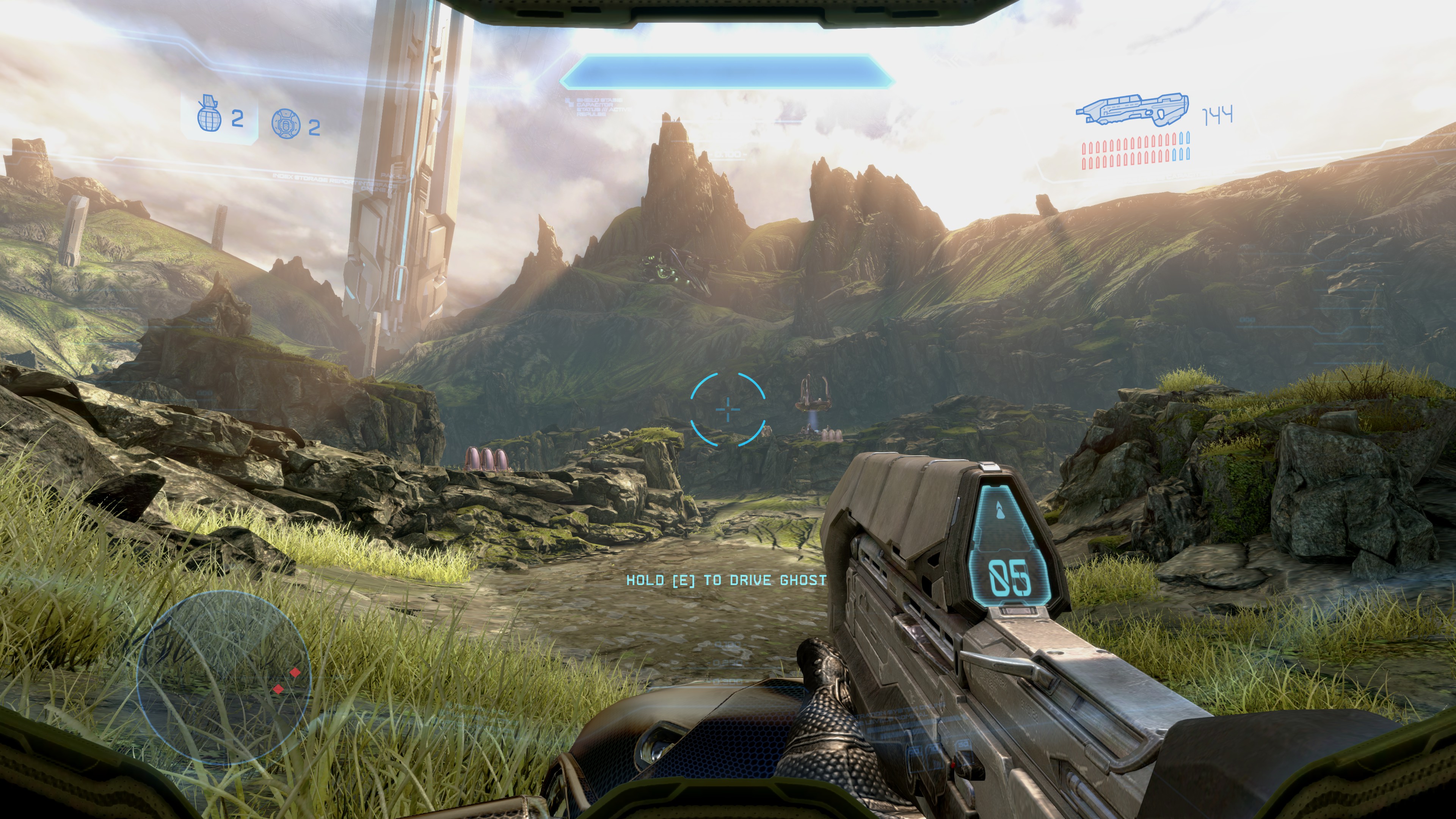
Behold. 4K Ingame on PC.


Halo fans are the best and the worst at the same time.I'm an Xbox fan and love halo.
I think all the screenshots looked great....
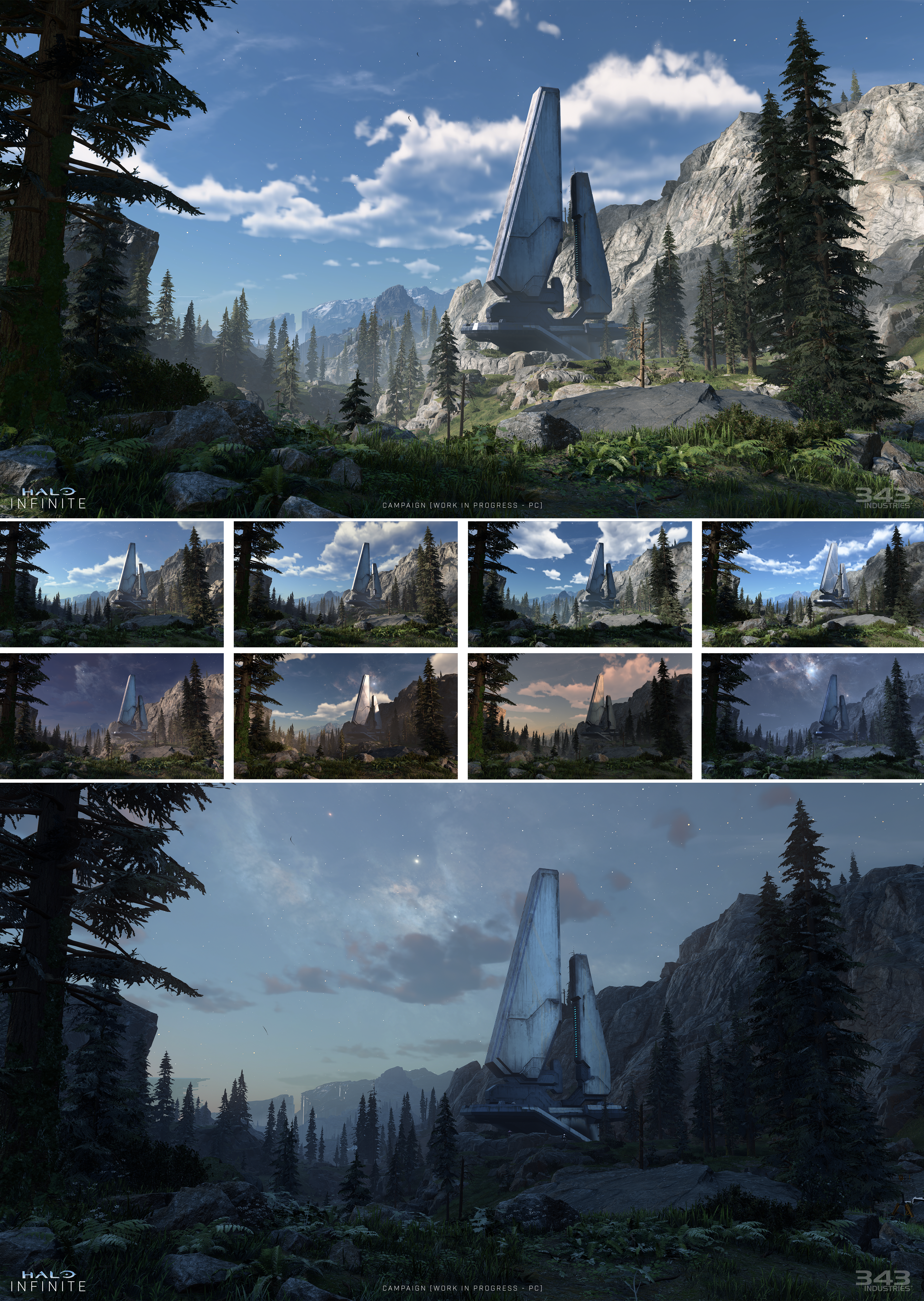
Up until I closely examined them - has anyone else noticed the amount of conceptual chalk art/What seems to be conceptual art overlaying/blending into some of the screenshots shown?
Anyone?
There isn't a consistency across images and in particular, the needle on the pine trees - some look chalked in, or mixed atop a conceptual art overlay... but others are highly detailed.
In one image, when looking at the tree line, then gazing towards the cliffs to the right - the conceptual art seems to be blended into the cliffside as well, and in some parts you see highly detailed textures.
It's as if the texture artist is plucking textures from concept art, drawn from conceptual chalk/thickly brushed concept art pieces... and meshing it together with the actual game assets.
Some of the trees in the distance, nay - many... are atrocious, awful and look as if they've been mixed/photoshopped with even worse conceptual art pieces.
I'm pro Xbox, a fan of good graphics too however - and I've seen far better on last gen - so I know Halo is capable of looking far better but for now
what gives with handing gamers photo's seemingly utilizing a blend of conceptual painted art overlaid atop in blended into actual in game screenshots.
Or perhaps they are just plainly using conceptual art for most texture derivatives. Which would be a jarring way to communicate Halo is going to use a mixed art style and filters across assets.
Visual Issues that I as a fan of both Xbox, and Halo... (and next gen graphics) have taken the time to highlight
However I do realize the game has essentially been 'restarted' I think a lot of these issues in fact communicate a partially mixed artstyle, and we haven't heard otherwise.
The die hard fanboys never disappoint. Spencer could proclaim world peace and that MS cured cancer + covid and the warriors would be like "But the unemployed in the arms and pharmaceutical industry".I came for the low energy shit posts and I wasn't disappointed

Well no shit, the game is being developed still.kinda looks unfinished?
looks better but still arguably worse than Shadowfall

if You think this looks better, you are crazyReminder: Halo 4.
This is where I am.It looks good
But well, its some handpicked screenshots running at the best settings possible on PC.
I'll make judgement when I see it running on Series X again in order to compare it to old footage.
Until then, I remain sceptical
if You think this looks better, you are crazy
People think they can consider random shit they made up as fact. Imagine that.Killzone 2 from PS3 era looks better, imagine that.
I'm an Xbox fan and love halo.
I think all the screenshots looked great....
Up until I closely examined them - has anyone else noticed the amount of conceptual chalk art/What seems to be conceptual art overlaying/blending into some of the screenshots shown?
Anyone?
There isn't a consistency across images and in particular, the needle on the pine trees - some look chalked in, or mixed atop a conceptual art overlay... but others are highly detailed.
In one image, when looking at the tree line, then gazing towards the cliffs to the right - the conceptual art seems to be blended into the cliffside as well, and in some parts you see highly detailed textures.
It's as if the texture artist is plucking textures from concept art, drawn from conceptual chalk/thickly brushed concept art pieces... and meshing it together with the actual game assets.
Some of the trees in the distance, nay - many... are atrocious, awful and look as if they've been mixed/photoshopped with even worse conceptual art pieces.
I'm pro Xbox, a fan of good graphics too however - and I've seen far better on last gen - so I know Halo is capable of looking far better but for now
what gives with handing gamers photo's seemingly utilizing a blend of conceptual painted art overlaid atop and blended into actual in game screenshots.
Or perhaps they are just plainly using conceptual art for most texture derivatives. Which would be a jarring way to communicate Halo is going to use a mixed art style and filters across assets.
Visual Issues that I as a fan of both Xbox, and Halo... (and next gen graphics) have taken the time to highlight
However I do realize the game has essentially been 'restarted' I think a lot of these issues in fact communicate a partially mixed artstyle, and we haven't heard otherwise.

Listen to me crying
Listen to me crying more
Troll. Ignore my threads and posts. I won't be here long.
Unfortunately the gun looks like the only thing actually rendering at 4k in that image.The guns actually have detail on them and don't look like plastic toys. See what happens when you don't accept mediocrity?
Is this a joke post?
I'm an Xbox fan and love halo.
I think all the screenshots looked great....
Up until I closely examined them - has anyone else noticed the amount of conceptual chalk art/What seems to be conceptual art overlaying/blending into some of the screenshots shown?
Anyone?
There isn't a consistency across images and in particular, the needle on the pine trees - some look chalked in, or mixed atop a conceptual art overlay... but others are highly detailed.
In one image, when looking at the tree line, then gazing towards the cliffs to the right - the conceptual art seems to be blended into the cliffside as well, and in some parts you see highly detailed textures.
It's as if the texture artist is plucking textures from concept art, drawn from conceptual chalk/thickly brushed concept art pieces... and meshing it together with the actual game assets.
Some of the trees in the distance, nay - many... are atrocious, awful and look as if they've been mixed/photoshopped with even worse conceptual art pieces.
I'm pro Xbox, a fan of good graphics too however - and I've seen far better on last gen - so I know Halo is capable of looking far better but for now
what gives with handing gamers photo's seemingly utilizing a blend of conceptual painted art overlaid atop and blended into actual in game screenshots.
Or perhaps they are just plainly using conceptual art for most texture derivatives. Which would be a jarring way to communicate Halo is going to use a mixed art style and filters across assets.
Visual Issues that I as a fan of both Xbox, and Halo... (and next gen graphics) have taken the time to highlight
However I do realize the game has essentially been 'restarted' I think a lot of these issues in fact communicate a partially mixed artstyle, and we haven't heard otherwise.
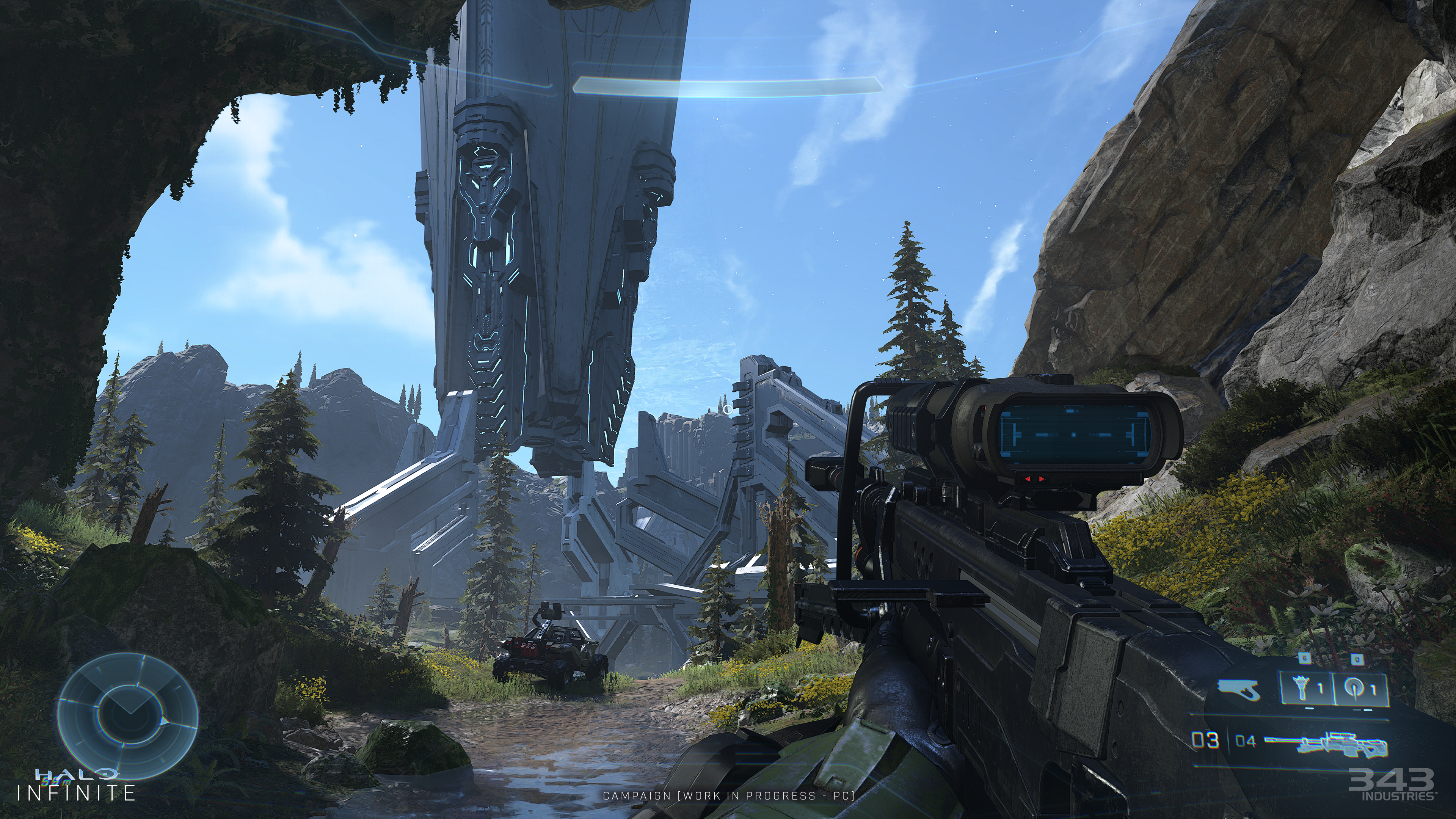
Work in progress, it's in the bottom of that same screen : Dkinda looks unfinished?
This is beautiful! TOD lighting, real-time weather but not a fully open world makes this incredible! I feel this could be the best Halo ever, it's all starting to come together I feel.Look way better now, so excited to play it
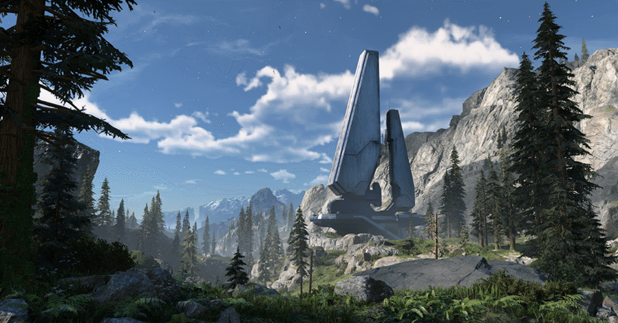
It's crazy that the weather changes everything
ok now go to rewatch state of play again...and continue to cry warriorPer my last post with screenshot descriptions, After really... reallllllly...... considering what I'm combing over.
Most of the asset's look considerably worse than last gen videogames and assets.
Last gen games and assets... all of which have higher fidelity, higher poly counts, better textures and look on the whole completely next gen (screenshots from well into last gen look next gen) compared to what Halo is showing off.
What in the world.
It's as if Microsoft is saying 'We are going to say to the world, we can ensure our flagship game performs graphically worse and still be the biggest baddest on the block in the console war. In fact, we can restart dev on this game and effectively ensure our game REMAINS graphically inferior - and people will still buy our product and we will still dominate'
Seriously...
Unless they plan on fixing things.
So wrong, it looks loads better! A bit of free advice, when you say silly things people won't take your comments seriously.It looks exactly the same???? (Jk! Looking a wee bit better!)
Bye!Reminder: Halo 4.
It kinda looks unfinished?kinda looks unfinished?
 How you work that one out Sherlock? I bow to your powers of perception
Yeah we have real geniuses here .It kinda looks unfinished?
Damn, is this your day job? I've seen less effort on building structures meetings, when trying to discuss design problems. That is almost a presentation. Quicky send it to 343i. I suppose the people working there will be thrilled that their work in progress i being scrutinized on a forum with this passion.I'm an Xbox fan and love halo.
I think all the screenshots looked great....
Up until I closely examined them - has anyone else noticed the amount of conceptual chalk art/What seems to be conceptual art overlaying/blending into some of the screenshots shown?
Anyone?
There isn't a consistency across images and in particular, the needle on the pine trees - some look chalked in, or mixed atop a conceptual art overlay... but others are highly detailed.
In one image, when looking at the tree line, then gazing towards the cliffs to the right - the conceptual art seems to be blended into the cliffside as well, and in some parts you see highly detailed textures.
It's as if the texture artist is plucking textures from concept art, drawn from conceptual chalk/thickly brushed concept art pieces... and meshing it together with the actual game assets.
Some of the trees in the distance, nay - many... are atrocious, awful and look as if they've been mixed/photoshopped with even worse conceptual art pieces.
I'm pro Xbox, a fan of good graphics too however - and I've seen far better on last gen - so I know Halo is capable of looking far better but for now
what gives with handing gamers photo's seemingly utilizing a blend of conceptual painted art overlaid atop and blended into actual in game screenshots.
Or perhaps they are just plainly using conceptual art for most texture derivatives. Which would be a jarring way to communicate Halo is going to use a mixed art style and filters across assets.
Visual Issues that I as a fan of both Xbox, and Halo... (and next gen graphics) have taken the time to highlight
However I do realize the game has essentially been 'restarted' I think a lot of these issues in fact communicate a partially mixed artstyle, and we haven't heard otherwise.
