-
Hey, guest user. Hope you're enjoying NeoGAF! Have you considered registering for an account? Come join us and add your take to the daily discourse.
You are using an out of date browser. It may not display this or other websites correctly.
You should upgrade or use an alternative browser.
You should upgrade or use an alternative browser.
The art style of the Demon's Souls remake looks terrible
- Thread starter Cliff Underside
- Start date
- Opinion
Gamerguy84
Member
I agree, it looked amazing..
DonF
Member
I'm pretty sure that the look of the original is heavily functional, not a style choice. I mean, there is a demons souls artbook, bluepoint must have access to lots of original material for the game and this might be the original vision, and maybe the ps3 look is more of a technical limitation, a concession.
Last edited:
Alexios
Cores, shaders and BIOS oh my!
Remake != remasterSecond best remaster after CoD4 IMO, that's how you actually "remaster" games, not just bump the resolution and ask 60$ for it.
There are plenty more remakes than just those two too.
Though certain remakes have "remaster" in the actual title cos it's just so widespread.
Last edited:
Lethal01
Member
I'm pretty sure that the look of the original is heavily functional, not a style choice. I mean, there is a demons souls artbook, bluepoint must have access to lots of original material for the game and this might be the original vision, and maybe the ps3 look is more of a technical limitation, a concession.
I don't think being dark and dreary is due to a technical limitation.
Rodolink
Member
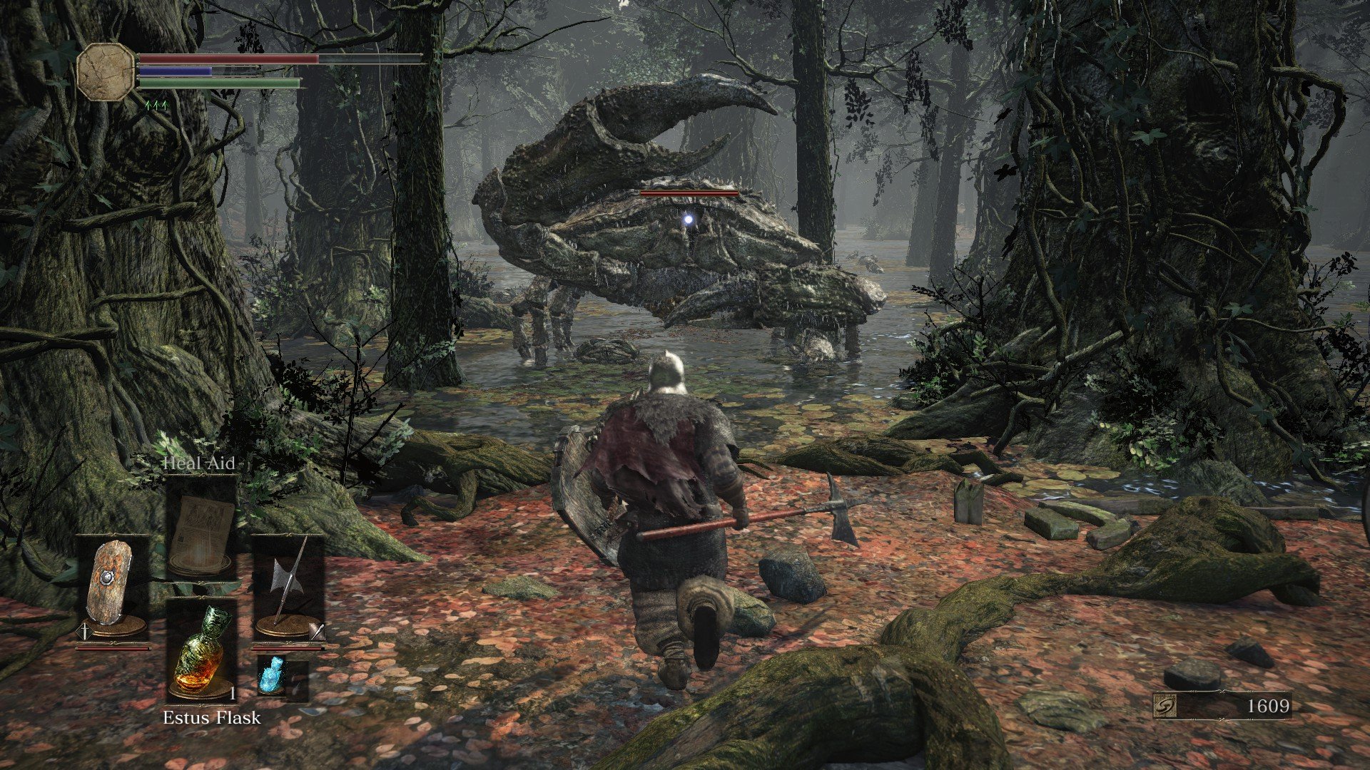
that dragon god doesn't look scary at all compared to the original, and overall this remake looks more like a westernization process, simply they don't have the japanese feeling.
the camera angles, the length of the shots, the speed of animations, and mostly the colors the original was simply grey, this one looks like a rainbow in comparison.
the camera angles, the length of the shots, the speed of animations, and mostly the colors the original was simply grey, this one looks like a rainbow in comparison.
hyperbertha
Member
I've just now come to know Bluepoint is a western studio. That explains their total lack of design sensibilities. They've butchered the art style into something akin to blizzard. But I was never looking forward to a demon's souls remake so its fine by me either way. Still not a good look though and makes me vary of their future games.
Stiflers Mom
Banned
When I saw that trailer the first time, I thought this would be Bloodborne 2.
That blue and orange colour scheme plus churches and plants.
This looks amazing, but not like Demon's Souls.
Demon's should be brown and bleak.
That blue and orange colour scheme plus churches and plants.
This looks amazing, but not like Demon's Souls.
Demon's should be brown and bleak.
DonF
Member
The trailer looks dark and dreary to me. I think that both games look great. As a matter of fact, I didn't notice a huge difference with the remake trailer cause thats the way I remembered the of game. I had to look at comparison videos to see the huge difference.I don't think being dark and dreary is due to a technical limitation.
Elder Legend
Banned
The artstyle of this thread and original poster take looks terrible.
Arachnid
Member
He's not talking about graphic fidelity. He's talking about changes in aesthetic and atmosphere. I get it. The glowing eyes and monster redesigns really do look like something out of WoW. There is a HUGE difference in feel/aesthetic between the original and this one. The original one had a more oppressive/grim feel. This looks/feels more like western/high fantasy.Threads like this hurt me deep inside my ass. God forbid more graphic fidelity in games.
That said, I actually really do like the new look. I'd probably prefer the old look more, but I do like the fact that the new look more differentiates Demon Souls from Dark Souls. Before, they were pretty similar IMO.
cryogenic7
Member
Keep playing the old version if you like it better. No one is stopping you.Assuming the trailer and screenshots are in-engine footage, which they seem to be, and not CGI. I feel like I'm completely alone on this, so I'm probably either gonna get a lot of flak or be completely ignored, possibly deservedly so, but since I love Demon's Souls so much I feel the need to discuss this anyway. My first impression of the trailer was negative, I immediately hated this new art direction they're going for. Then I learned it's being developed by Bluepoint, the same studio that remade Shadow of the Colossus 2 years ago. I never liked the way the SotC remake changed the art style to make it more photorealistic, doing away with the old washed out look that emphasized heavy fog and bloom effects in favor of more realistic visuals. I don't want to write a whole wall of text about it, but there's a pretty good article here that talk more in depth about the pros and the cons of that game.
Now back to the main point, Bluepoint seems to be giving the same treatment to Demon's Souls, which already looks more like Warcraft than a Souls game. It just looks so generic and bland! something about the models, the materials, and the colors just strikes me as plasticky and boring. The whole point of remaking a game is to bring it up to standard with the current gen, but is it not possible to do so while staying faithful to the original vision?
SuperYoshi
Neo Member
Can y'all wait till we get actual gameplay.
Chiggs
Member
I have both my physical and digital versions of DS on the PS3, played it as recently as 2018 to finally plat it... and I really like the look of the new one. I’m all in on it, and I hope they added the 6th Archstone as well.
I can understand people’s perspectives, for me personally I like the look of both, and can enjoy both in their own context. The original didn’t go away either.
I’m doing that now, but I’m trying to crawl out of pure black character tendency to get the final ring.

S
SLoWMoTIoN
Unconfirmed Member
I agree with the OP. I'm getting a darksiders feel over it.
DavidGzz
Member
I love it but I was never married to the original look. Played the crap out of it and I welcome Bluepoint's take. Looks like the Dark Souls 4 we may never get graphics wise. I am concerned about gameplay though. It has to evolve animation wise at least. Beautiful graphics plus jank don't mix.
I Love Rock 'n' Roll
Member
What's wrong with He-Man? He's still stronger than any of your virtual men (on topic, i prefer in most cases the new looks of the remake).Jesus, some people really have rose-tinted goggles bolted to their skulls. The original Demon's Souls already had a bunch of by-the-books enemy designs that looked as if they belonged in a He-Man cartoon, and people even shit on the game for it back in 2009, and a washed-out color palette didn't hide that.
I like the OG game's atmosphere a lot, yes, but let a remake be a remake and try to do some shit different.
Now i want He-Man in Dark Soul/Demon Soul. He would be great.


Last edited:
kikii
Member
It's what happens when you remake PS360 games era. It happened to the original Gears of War and its Ultimate Edition. They lose all the atmosphere the "all brown and grey" games had with its limitations.
I kind of don't like the liberties they took with some character design thought. They are crearly not the same.
who cares? u will get floored sameway anyways

DavidGzz
Member
Didn't BluePoint say they were going to redefine visuals with this game? All I'm seeing is a slightly better version if what current gen delivers.
It absolutely murders DS3, even the PC version, which is the closest thing I can think of.
Reindeer
Member
DS3 isn't exactly that great looking, even with max settings on PC. The remake does look better than current gen stuff, but not by that much. BluePoint were hyping up the visuals for the game and it only looks ok for next gen, nothing special.It absolutely murders DS3, even the PC version, which is the closest thing I can think of.
Last edited by a moderator:
DavidGzz
Member
DS3 isn't exactly that great looking, even with max settings on PC. The remake does look better than current gen stuff, but not by that much. BluePoint were hyping up the visuals for the game and it only looks ok for next gen, nothing special.
I'll agree to disagree. I think it looks way better than I expected. The screens are insane.
Pejo
Member
This isn't really a fair comparison because Dark Souls Remastered (on PC where the main complaint came from about this) was actually a significant downgrade over vanilla Dark Souls with DSFix applied. On console it was a straight up upgrade, and even on PC the directional lighting was improved (though it still looked worse most of the time IMO).
(stolen from r/Eldenring)
Anyway, on topic - I agree with OP. The graphics are a HUGE improvement, but the art style took a big fucking hit. I'll still play it, but now I'm nervous about all sorts of changes from actual gameplay and PVP/summoning systems, etc. Demon's Souls is my favorite Souls game, and it's almost entirely due to atmosphere and artstyle. The gameplay is dated, the graphics are dated, but the atmosphere is still the best out of any of the other Souls games, IMO. I hate the new Vanguard demon design the most out of everything I've seen.
Kadve
Member
This is kind of what I'm talking about. Even without "anime" art style you can easily tell difference between Japanese aesthetics and western aesthetics, even game like Ghost of Tsushima that has Japanese setting, its still very much western game both in design and aesthetics.
Yes, big budget western games have been trying to be as realistic as possible ever since 3d starting becoming popular. Japan is one of the few places where games with unique art styles is regularly made.
Try to imagine something like persona 5 made by a western studio for example, i sure can't.
(and while where at it, the same can be said for cartoons now too, everything made in the west is either flash or cg)
Last edited:
EightBit Man
Member
I will never get a PlayStation 5, but it looks pretty darn fine I think.
AetherMage
Member
Looks great so far. They need to make a ton of changes for it to feel like it belongs on PS5. Next people will complain you move too fast on ladders or the camera isn't shit enough.
Roman Empire
Member
Flamelurker is the only bad thing about this Remake. They changed its gross appearance (the melted flesh on the bone design was so good and disturbing).Other than the flamelurker and flute knight set changes I don't see how it's not a huge improvement
LazyParrot
Member
But then you'll have to find a new excuse for why you suck at the game.Hopefully they fix awful gameplay and controls too.
LarknThe4th
Member
I think it looks okay, but the real test will be Latria, it was the most visually stunning area in the original and seeing that in full next gen glory is like half the reason I'm excited for the remake
JeloSWE
Member
Froms software games have always looked so grey, rough and unpolished, I never liked that looks and stayed away from their games but the remake is so incredibly beautiful I just had to try it, and I've almost finished it. I hope Elden Ring can match what Bluepoint pulled off here. The amount of colors are just right, much better than what FS usually goes for. I also hope BP will do remakes of DS and Bloodborne as well. Their artist's are doing an amazing jobb.
Last edited:
SlimeGooGoo
Party Gooper
.
Last edited:
kingpotato
Ask me about my Stream Deck
I was playing the mines earlier and was struck at how poorly the original game conveyed the setting compared to the remake. I think from did well considering the limitations but they've shown by their own evolution over the years there's room for more. The colors on later games are still muted, but it's much more vibrant than demon's souls.


Vs

Vs
Last edited:
SlimeGooGoo
Party Gooper
.
Last edited:
Killer8
Member
Not enough is being said about how butchered the soundtrack is.
For example Maiden in Black goes from a very minimalist and recognizable tune, something balancing both despair and hope at once:
To a track bogged down by Gregorian chanting and orchestral pomp, the recognizable part relegated to only the last minute:
This is basically a microcosm of a lot of the artistic changes in the game. In it's own way, it looks and sounds fantastic. But it misses the original intent. The game simply doesn't feel the same to me - it might play the same, the level layout is very similar, but it's a different atmosphere conveyed and my mood is not the same when playing it. I do not get the same feelings from this game.
JohnnyFootball
GerAlt-Right. Ciriously.
Not enough is being said about how butchered the soundtrack is.
For example Maiden in Black goes from a very minimalist and recognizable tune, something balancing both despair and hope at once:
To a track bogged down by Gregorian chanting and orchestral pomp, the recognizable part relegated to only the last minute:
This is basically a microcosm of a lot of the artistic changes in the game. In it's own way, it looks and sounds fantastic. But it misses the original intent. The game simply doesn't feel the same to me - it might play the same, the level layout is very similar, but it's a different atmosphere conveyed and my mood is not the same when playing it. I do not get the same feelings from this game.
The soundtrack IMO is the only thing the Remake completely butchered.
RasAlGhoul
Member
Clown thread for real.
Killer8
Member
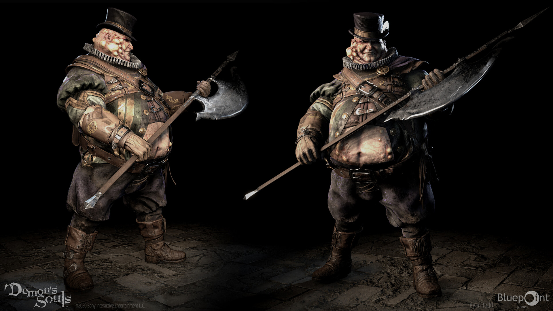
I'm pretty sure that the look of the original is heavily functional, not a style choice. I mean, there is a demons souls artbook, bluepoint must have access to lots of original material for the game and this might be the original vision, and maybe the ps3 look is more of a technical limitation, a concession.
The original game matched the artwork fairly closely:
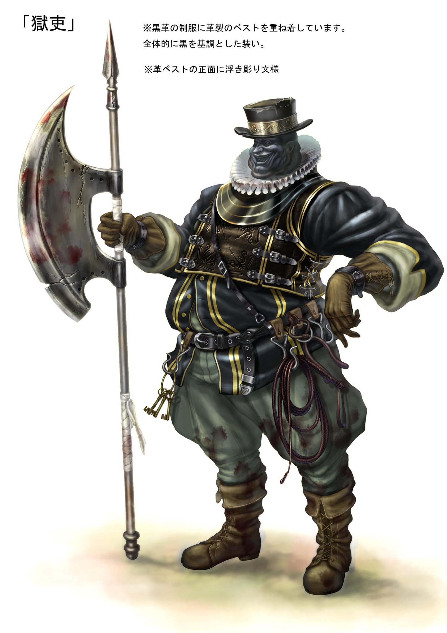
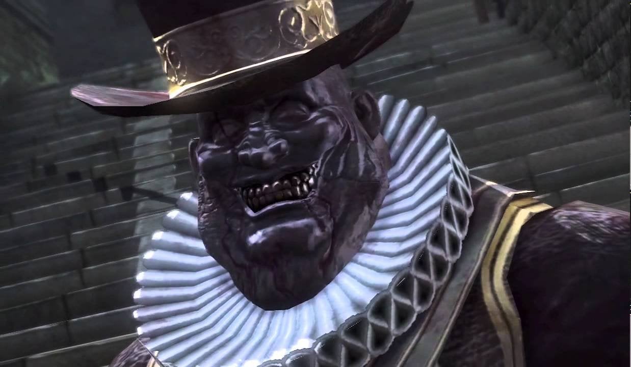
Whereas the remake changes it from a fixed grin like he's wearing a death mask, to a fat bloke from norf England who's lost his Gregg's sausage roll:

Last edited:
SlimeGooGoo
Party Gooper
.
Last edited: