TidusYuna
Member
There's a good PSP Remake of Lunar 1, I highly recommend it
") Yup, I own it. We didn't get the remake for Lunar 2 . I just want a dualpack of this classic on modern consoles, remaster or remake.
Yup, I own it. We didn't get the remake for Lunar 2 . I just want a dualpack of this classic on modern consoles, remaster or remake.There's a good PSP Remake of Lunar 1, I highly recommend it
Yup, I own it. We didn't get the remake for Lunar 2 . I just want a dualpack of this classic on modern consoles, remaster or remake.I'm finding out as more and more of these projects are greenlit, my imagination did a LOT of favors for these games, in both how scenes play out and what things looked like, and the quality of the story writing.
I'm not sure I honestly want more classic JRPGs to be remade, they seem to only be able to disappoint me.
Yeah, fucking gorgeous but different strokes for different folks I guess.How can anyone look at this and say its ugly? I looove this visual style so much.
How can anyone look at this and say its ugly? I looove this visual style so much.
No. HD-2D is an ugly, lazy and inconsistent mess
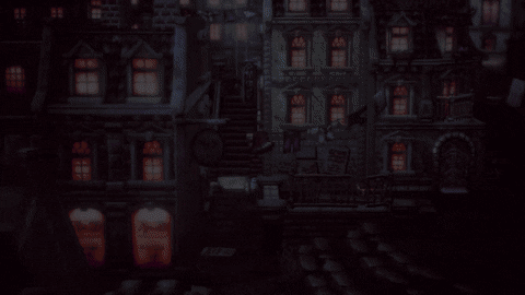
We need more of this:
Hi. I just came to say that I completely agree withMister Wolf
I *know* that's what Squeenix refers as "HD-2D".
What I meant to say is that there's nothing "HD" about it.
Bravely Default has high resolution art (i.e. not pixel art) and would make more sense to use the "HD" terminology for that type of game instead.
There's nothing properly blended,
Not to mention all those tiling textures on the ground, overuse of depth of field, photorealistic lighting on 3D environments but sprites have cartoon shading, high resolution UI & text that do not match the sprites' resolutions, and on and on.
It's a mess
People are blinded by nostalgia, and are desperatly craving for good JRPGs again, like those of the SNES/PS1 era.
But this is not it.
This is focusing on the superficial to cheapen development costs.
All those "HD-2D" games do is reward Squeenix for embracing mediocrity and getting rich along the way.
I want you to see the LIGHT


Hi. I just came to say that I completely agree withSlimeGooGoo . I think a modern pixel art game like Sea of Stars or Eastward can be really beautiful. I also think there's merit in the chunky polygonal look of the DQ5 PS2 game. I think a modern version of that look could be really good.
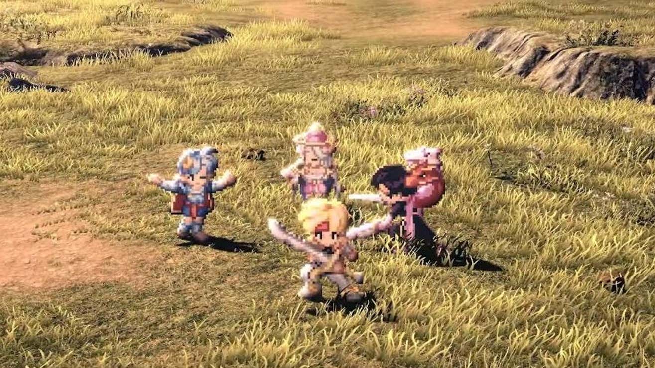
The blending of these two styles seems like the worst of both worlds. I genuinely hated the look of SO2R, despite the fact that it's one of my favorite games of all time. Slime hit the nail on the head with the awkward modern camera effects and advanced lighting that doesn't blend at ALL with the sprites or environment. Why are the fucking sprites shaded like that? I hate it. Just make them chunky 3D models that match the world.
Look at this fucking scene. There is so much bloom applied to the huge, low pixel count sprites they just look like a mess, and they contrast so terribly against the detailed environment. This could have been completely resolved if they used models instead.
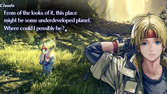
Orrr look at this scene:
Claude has both highlights and shadows cast across his sprite, and then he's standing in front of a yellow green scene. This makes his sprite actually very difficult to clearly see.
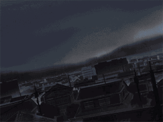
This is a rough approximation of how Tri-Ace originally intended for this scene to look, and it still looks gorgeous.
The character sprites look great, the portraits pop. Everything was meticulously designed to appear beautiful on a CRT. There was a very specific intention to how all of the artwork was created in the 1990s with CRT considerations.
I love pixel art games. But you can't just take that and throw a bunch of shit on top of it and blast the resolution to 4k and call it "HD-2D;" it looks like shit.
Slime's example with Bravely Default's backgrounds was a great one. THAT is what I consider "HD-2D." Actual high definition 2D artwork. It's funny, now that I think about it- it's the exact opposite of most HD-2D examples. Sprites on 3D vs 3D on flat HD artwork.
I just think the latter works far better than the former.
I remember the days of the internet hating the 3D chibi models of games like Bravely Default.I usually agree with Slime but once I saw him/her/they/them shilling Bravely Default's visual style over Octopath 2 I was like hell naw. Bravely Default is gonna age like milk at FTL speeds.
So Octopath Traveler 2 looks bad to you as well?
KillWhat about me

No it's marry at leastKill
Get in the lineNo it's marry at least
They already making new games, Atlus alone is releasing two new IP this year.Make new games!
Dragon's Dogma 2 and Rise of the Ronin are coming soon at the very least.Make new games!
FUCK me, I just want it in English, is that too much to ask?Its gone....
Hah no you won't. Ain't gonna happen Cap'n.If I find you, I'll marry you.
What if...Hah no you won't. Ain't gonna happen Cap'n.


FOOLISH FOOL! THERE IS ONLY ONE GILGAMESH AND YOU ARE NOT HE!What if...
I come dressed in a Gilgamesh costume?


