-
Hey, guest user. Hope you're enjoying NeoGAF! Have you considered registering for an account? Come join us and add your take to the daily discourse.
You are using an out of date browser. It may not display this or other websites correctly.
You should upgrade or use an alternative browser.
You should upgrade or use an alternative browser.
New Zealand's new flag might be Silver Fern (Red, White, and Blue)
- Thread starter lastplayed
- Start date
- Status
- Not open for further replies.

ThoseDeafMutes
Member
I vote to keep the monarch as head of state of Australia until Liz abdicates or carks it.
I also put forward to motion that we bury Tony Abbott alive with her when she dies, but I realise that may be a little controversial.
I'll abolish the monarchy but only as a package deal where we merge with NZ.
No 1: Looks nice and has a clean look to it. Arguably might be a bit too simple for some.
No 2: Can't help but think of Pepsi/NBA logo and all their variations that are out there, which kinda ruins this one for me.
No 3: This just look like some terrible company logo rather than a National flag.
No 4: Nice in between mix of the current flag and what they are looking for in the new flag, can't help but feel a bit cluttered though due to the random use of colours.
Personally No 1 is my preferred one out of the above, it might be even better if they added the 4 stars in a simple black colour to it as well? EDIT: Looking at the 3D rendered version No 4 works better than I expected, so that my preferred one now.
kraspkibble
Permabanned.
#2 or #4
Why are they changing it anyway?
Why are they changing it anyway?
30yearsofhurt
Member
#2 or #4
Why are they changing it anyway?
Cos they hate poms too.
#2 or #4
Why are they changing it anyway?
It will only change if people vote for a new one over the current one
WhiteRabbitEXE
Member
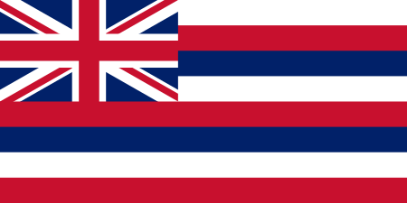
Hawaii is kind of an odd one, because we had New Mexico, Arizona, and Alaska back-to-back with bad-ass unique flags right before it. That said, Hawaii still beats the overwhelming majority of the US I'd say. They really are mostly shit.Most of the states in the union need to change their flag.
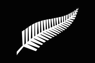
2 looks the best. I liked 1 and 4 more at first because of the black colour, but when the flag is actually floating, next to others, having it mostly black makes it just sad and boring. I have no idea why 3 is a thing, the swirl just looks random.
[edit] By 2 I meant the red and blue with the white fern.
[edit] By 2 I meant the red and blue with the white fern.
Watch this:
https://www.ted.com/talks/roman_mar...signed_thing_you_ve_never_noticed?language=en
And you'll see why of those choices, the peak one is the best.
Thanks for sharing this. Very eye-opening. As a resident of Milwaukee I was pretty horrified to realize how abhorrent our city flag actually is. Wow. That thing should not be allowed to exist. That also got me looking at a lot of other city and state flags and realizing how across the board terrible a lot of flag design actually is. That talk totally reinforced my feeling that all of these proposed NZ designs are poor. And this is a flag that is going to be shared on a global level. I actually feel kind of bad for NZ and wish they had a proper symbolic and less superfluously intricate option to choose.
Hyperactivity
Banned
I'd vote for it in a flash, great flag with heritage but it has been co-opted by the Union movement and therefore the other side would never ever ever ever ever allow it.
Searched up what you meant by this
This is weirdness I cannot comprehend
LiquidSolid
Member
2 looks the best. I liked 1 and 4 more at first because of the black colour, but when the flag is actually floating, next to others, having it mostly black makes it just sad and boring. I have no idea why 3 is a thing, the swirl just looks random.
[edit] By 2 I meant the red and blue with the white fern.
https://en.wikipedia.org/wiki/Koru
I wish we could pick the Tino rangatiratanga:

As it is, I think I'll vote for the black/white fern for the first question and then to keep the current flag for the second. I'm basically hoping that they throw away the current five awful options, take the hint and try again, this time with some good flags that feature the silver fern. The designer of the All Blacks logo offered to redesign them, so take him up on his offer.
I know this is unlikely but I hope New Zealand sticks with what they have. I could always tell the difference between it and the Aussie one. I find them iconic and dig them.
Both the Aussie and NZ flags are archaic crap. Australia needs its own too. Should be the Aboriginal flag.
Both the Aussie and NZ flags are archaic crap.
Yes. Come join Canada in the post-colonial world. We ditched our old flag 50 years ago.
Troubled Bat
Member
Am I the only one that like 4? Lol
lastplayed
Member

OP needs to be updated with the 5th official option.
RED PEAK FOR LIFE!
ps: please vote for red peak, the superior option
I signed the petition to get it up there!
OP needs to be updated with the 5th official option.
RED PEAK FOR LIFE!
ps: please vote for red peak, the superior option
That's what I picked!
")
The Koru would be my next choice. The tired silver fern imagery just reminds me of New Zealand's obsession with niche sports.
OP needs to be updated with the 5th official option.
RED PEAK FOR LIFE!
ps: please vote for red peak, the superior option
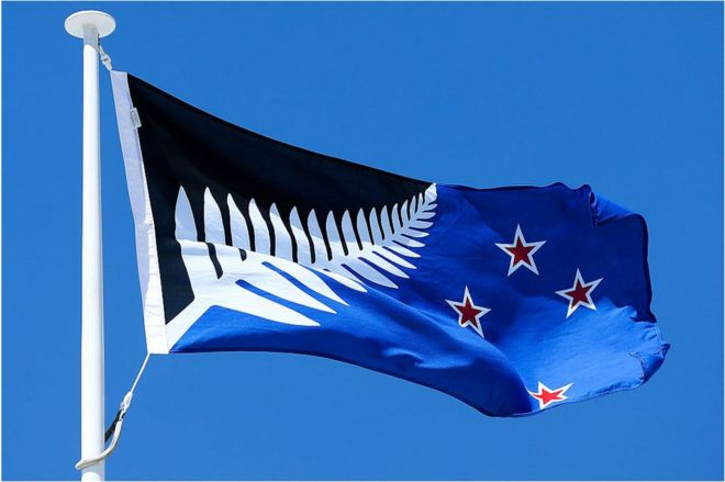
This looks good, finally an option that doesn't look bad.
I still like this one though
AnotherDayAnotherDollar
Banned
This looks good, finally an option that doesn't look bad.
I still like this one though
Isn't that what's in the All Blacks jersey? If not that, then it's something very similar.
Isn't that what's in the All Blacks jersey? If not that, then it's something very similar.
its not exclusive to the all blacks, other nz sports teams use it too.
lastplayed
Member
Isn't that what's in the All Blacks jersey? If not that, then it's something very similar.
That particular fern design is trade marked and used by the All Blacks, that's why none of the ferns on the flag options look like that.
LiquidSolid
Member
That's what I picked!
The Koru would be my next choice. The tired silver fern imagery just reminds me of New Zealand's obsession with niche sports.
SMH. The level of ignorance you have to have to label our national sports (especially cricket, the second most popular sport on the planet, but rugby too) "niche" or not know how important the silver fern is to Maori and NZ culture is pretty mind boggling. I mean fuck, where do you think the Koru comes from?
That particular fern design is trade marked and used by the All Blacks, that's why none of the ferns on the flag options look like that.
As I said earlier though, the All Blacks logo designer offered to design one for the flag. An offer the government should've accepted long before we got to any referendum because the current designs suck.
SMH. The level of ignorance you have to have to label our national sports (especially cricket, the second most popular sport on the planet, but rugby too) "niche" or not know how important the silver fern is to Maori and NZ culture is pretty mind boggling. I mean fuck, where do you think the Koru comes from?
LOL! I was talking about Netball!
I never said the fern wasn't important to New Zealand culture. The way the ferns have been represented on the three flags just remind me of sports logos, ala the Silver Ferns. They're deadly dull and completely predictable.
As I said earlier though, the All Blacks logo designer offered to design one for the flag. An offer the government should've accepted long before we got to any referendum because the current designs suck.
Yes, the fern has a lot of cultural associations, but a white fern in the middle of a solid black background is pretty heavily tied to the all blacks at this point. As someone who doesn't give a shit about rugby, having what is essentially the all blacks logo as our national flag isn't particularly appealing to me personally. I'd rather keep what we have now than switch to that.
LiquidSolid
Member
LOL! I was talking about Netball!
I never said the fern wasn't important to New Zealand culture. The way the ferns have been represented on the three flags just remind me of sports logos, ala the Silver Ferns. They're deadly dull and completely predictable.
Netball? It's not really that popular and besides, what female sports aren't niche?
As for the ferns, I disagree. I don't think any NZ sports admins would approve such ugly silver fern designs in their logos.
Yes, the fern has a lot of cultural associations, but a white fern in the middle of a solid black background is pretty heavily tied to the all blacks at this point. As someone who doesn't give a shit about rugby, having what is essentially the all blacks logo as our national flag isn't particularly appealing to me personally. I'd rather keep what we have now than switch to that.
That's your (incredibly ignorant IMO) association, not everyone's. Sure, the All Blacks were the first to adopt it (mainly because Thomas Ellison, the captain at the time, was Maori), but it wasn't that long before the military did too, with the Coat of Arms, police, fire brigade and a range of other NZ services following soon after. To me and most NZers, the silver fern represents NZ, and most importantly, represents both Pakeha and Maori. Compare that with the current flag, which has always stood for colonialism.
bobnowhere
Member
Searched up what you meant by this
This is weirdness I cannot comprehend
I may not have made myself completely clear, the flag in the picture is the Eureka Flag, a flag first flown by a rebellion of Gold Miners in Ballarat Australia in the 1850's. It was also flown at the formation of the Australian Labour Movement that closely proceeded the formation of the Australian Labor Party, the nominally "less right" of the two major parties.
It's a fantastic flag, deeply evocative of standing up to authority and mateship, all the good stuff Pollies say are uniquely Australian qualities, but really aren't. Having the history attached to it would make it a great replacement for the current Australian flag but it's deep political roots to only one side of politics would ruin those chances.
As far as I'm aware it has nothing to do with Hawaii.
That looks pretty interesting, actually.
OP needs to be updated with the 5th official option.
RED PEAK FOR LIFE!
ps: please vote for red peak, the superior option
lastplayed
Member
OP needs to be updated with the 5th official option.
RED PEAK FOR LIFE!
ps: please vote for red peak, the superior option
Yes I've been a bit slack, added.
Gentle Rodriguez
Member
If they have any balls they'll choose for a flag that doesn't ALSO have the colors red, white and blue in it, we have plenty of those crap generic flags.
Honestly every country should get a new flag more unique flag, there'd be some confusion for a while but it'll work out better in the end.
Honestly every country should get a new flag more unique flag, there'd be some confusion for a while but it'll work out better in the end.
OP needs to be updated with the 5th official option.
RED PEAK FOR LIFE!
ps: please vote for red peak, the superior option
That's a good flag.
To me and most NZers, the silver fern represents NZ, and most importantly, represents both Pakeha and Maori.
Oh, please. I did point out that yes, the silver fern has a lot of cultural meaning. I was referring specifically to the style of white fern on a solid black background being strongly tied to the all blacks to me personally as a reason why I find it not a particularly appealing look for a flag.
Your language of "to me and most NZers" reeks of argumentum ad populum. Speak for yourself, don't claim to speak for your country. Also, calling someone ignorant for their personal opinion on the desirability of a flag design is completely irrelevant to the argument at hand.
Serial Butt Grabber
Banned
I like both black and whites ones, they look cool and unusual. Too bad people will probably choose something more conservative.
That's a good flag.
That's one ugly ass flag.
thisisneogaf.gif
Seriously tho, I like it.
gutter_trash
Banned
that is the best one in the bunch, love the color scheme.
the Red Peak one looks like a hardware store logo
User 73706
Banned
OP needs to be updated with the 5th official option.
RED PEAK FOR LIFE!
ps: please vote for red peak, the superior option
That's some Halo 5: Guardians-looking shit.
I'm in.
- Status
- Not open for further replies.