• Hey, guest user. Hope you're enjoying NeoGAF! Have you considered registering for an account? Come join us and add your take to the daily discourse.

Streets of Rage 4 - Behind the Art (video)

Kazza

Member
The new art style has been one of the more controversial aspects of Streets of Rage 4, so it's nice to get this perspective from the two guys responsible for the sprites and backgrounds:


You get to see the evolution of the new designs for Axel and Blaze, as well as a sneak peek at some not before seen backgrounds.
 

Saber

Gold Member
This game is taking so much time to launch that I even forget it existed.

It still cool though.

I know I say this in every thread. But the art style looks bad to me.

Should have been pixel art.

Also, they made Axle fat, but the others looks better. Fuck them.

I don't think looks that bad even though I totally agree with the pixel art stuff. I see some games looking amazing with it, even though are just pixels.

As for Axel, its totally understandable. But for me who have played SoR series over the years I sincerelly couldn't care much. I felt like those games brown noses him way too much imo. Can't say the same about Adam daughter though...shes lamish.
 
Last edited:
As I've written prior, the technical quality of the development team's work is fabulous. As for visual design, this game needed someone onboard, who was capable maintaining a look more inline with past entries.

For Wonder Boy III, the developer was faithfully recreating an older game that was also able to serve as a graphical template. Going by the video, the freedom given to the developer with SoR4 has resulted in their own take on the franchise, which aesthetically doesn't work for me.
 
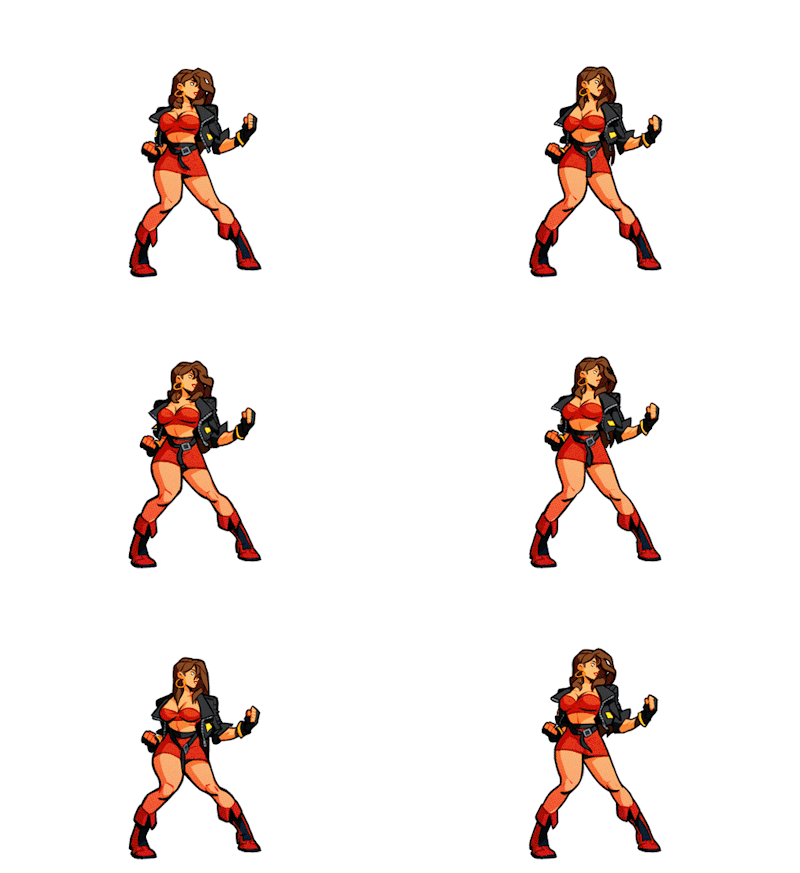
Controversial? Nothing's controversial about how T H I C C Blaze got. Girl took some notes from the Capcom chicks. Dem thighs? Perfecto 👍

eea.gif
 
Last edited:
Why people like jaggy pixels over smooth drawn art, is beyond me.
prob because pixel art gives sense of texture and can leave a bit to the imagination.

theres a time and place for both for sure.

the thing that irks me isnt the smooth/vector art style, its the small things like whenthe car crashes into the wall in the video... an attack shakes the environment and the entire car just bounces around like its a single piece of clip art. just uggo. reminds me of newgrounds. zero weight. totally breaks the immersion
 
Last edited:

Pejo

Member
Is this just a video of them fishing around in the trash and pulling out the character designs?

Only kidding, it doesn't look offensively bad, but I'm not a fan of the style in general.
 

Kazza

Member
We're 25 posts in, and while there have been some (reasonable) objections to the art style, nobody has said it looks like a flash game yet. Thank the Lord for small mercies.
 
S

SLoWMoTIoN

Unconfirmed Member
We're 25 posts in, and while there have been some (reasonable) objections to the art style, nobody has said it looks like a flash game yet. Thank the Lord for small mercies.
I mean this isn't Battletoads.
 

Ballthyrm

Member
We're 25 posts in, and while there have been some (reasonable) objections to the art style, nobody has said it looks like a flash game yet. Thank the Lord for small mercies.

Flash is but a distant memory for young people nowadays, fading by the day.
There is really only a 10 year window where flash game were really played.
 

Ballthyrm

Member
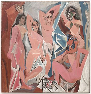
Hate this art style. Can't believe it took 4 years to make.

350px-Les_Demoiselles_d%27Avignon.jpg


It took over a year for Picasso to paint that and hundreds of sketches, drawings and painting .
Whatever you think of it. Some people love it, some people hate it, some people think it's not even art.

Point is.

Time investment is a very poor judge of quality.
 
Last edited:

Ailynn

Faith - Hope - Love
All the hatred this game gets for it's art style just makes me thankful I gave up 2D animation years ago. It would be absolutely crushing to me having done something like this and have people trash my best efforts.
 
Last edited:

cireza

Member
Good video, I did see some designs that I found better in their concepts. Too bad they always opted for the designs that have the most elements, it would have been better to have characters without jackets etc... Much cleaner, and thinner.
 

Kazza

Member
Good video, I did see some designs that I found better in their concepts. Too bad they always opted for the designs that have the most elements, it would have been better to have characters without jackets etc... Much cleaner, and thinner.

While I've come around to the "fat Axel" redesign, I wish they would take off that jumper he has tied around his waist. I think Blaze's jacket is ok though.

a90b2bf4b2ccc7bf7ff52a686e5ce311.gif
tumblr_pfefqs4Bt71t2l8luo1_400.gifv
 
Top Bottom