• Hey, guest user. Hope you're enjoying NeoGAF! Have you considered registering for an account? Come join us and add your take to the daily discourse.

Video Game HUDs

R6Rider

Gold Member
With the upcoming Dead Space Remake and The Callisto Protocol, some friends and I were discussing HUDs from various games. Decided it might make an interesting topic here.

Here are some that always come to mind for various reasons:

Dead Space - Essentially your HUD is the in game HUD your character sees and uses. Health bar is part of your iconic suit.


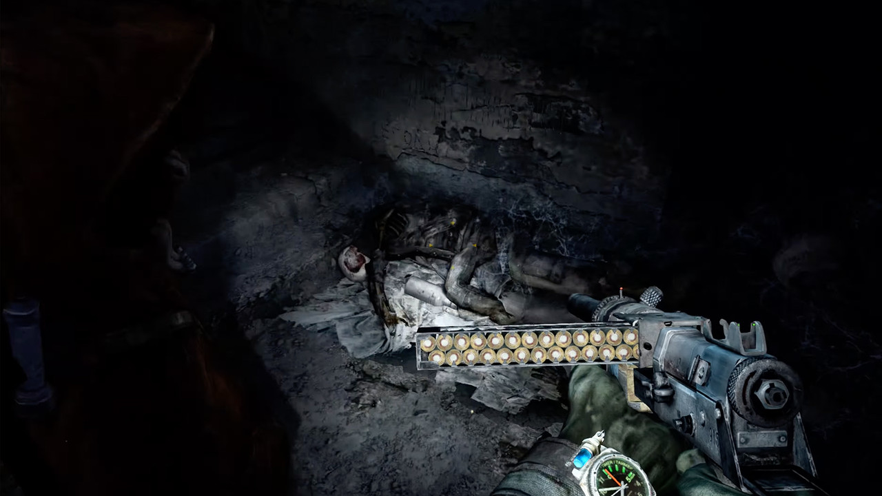
Metro Last Light - Guns designed for identifying ammo left with the wrist having extra information easily viewable.


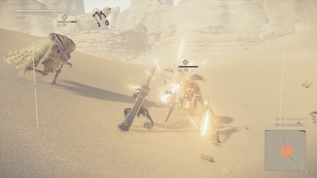
Nier Automata - Directly integrated into the gameplay and menu using the chip system. Also directly changes UI and audio elements as well. Couldn't find any direct images of the menu, so this isn't the best example...


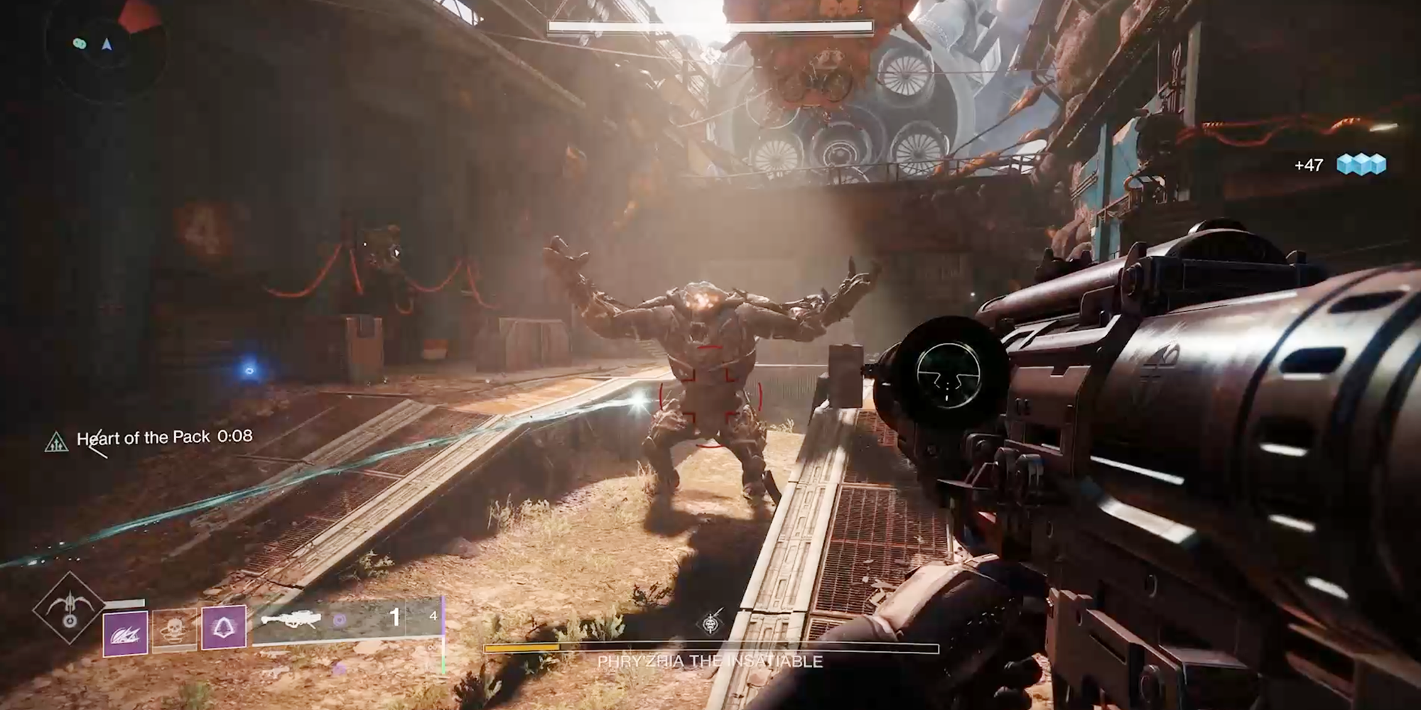
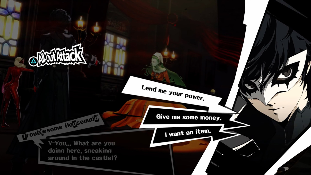
Persona 5 - Very stylistic HUD with larger elements used throughout and often animated as well.


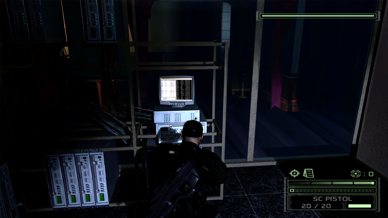
Splinter Cell: Chaos Theory - The majority of the info is displayed in the bottom right corner. Simple yet effective.


EDIT: Also, I didn't include any VR examples, because those would almost be a new topic in themselves, but feel free to share those too.
-
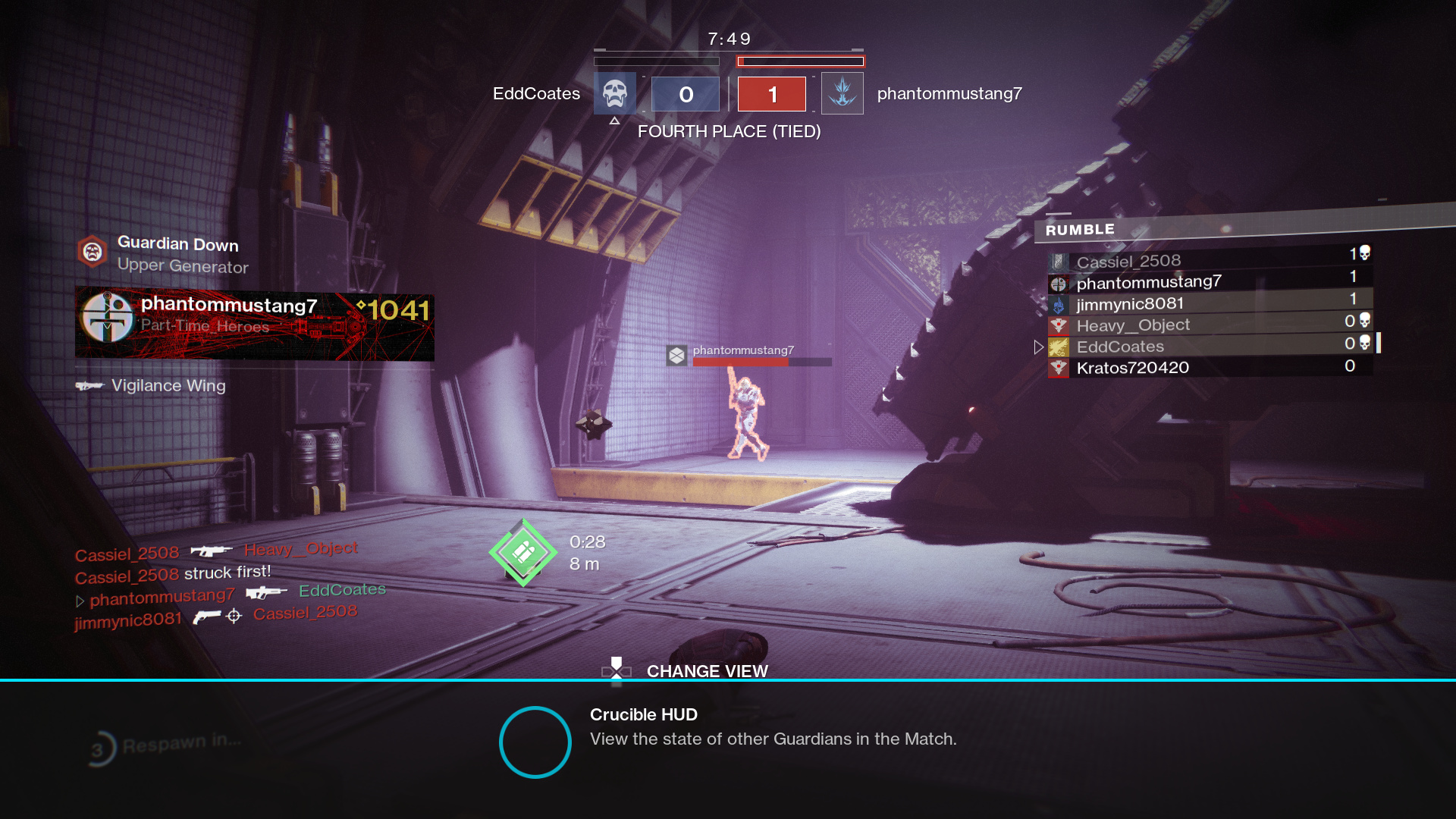
So are there specific game HUDs that you love? Hate? Or maybe one that stands out to you or is memorable for whatever reason?
 
Last edited:

MidGenRefresh

*Refreshes biennially
I like when HUD elements are grounded in the environment . Like in Far Cry 2:

1a067155616671.598bbd7750c2f.jpg
 
I like when HUD elements are grounded in the environment . Like in Far Cry 2:

1a067155616671.598bbd7750c2f.jpg
The worst hud I can remember has monster hunter so cheap and ugly disgusting colors like a toy from toysrus everywhere yellow green red absolutely tasteless and cheap I love monster hunter but the hud is absolutely disgusting of that game
 

R6Rider

Gold Member
The worst hud I can remember has monster hunter so cheap and ugly disgusting colors like a toy from toysrus everywhere yellow green red absolutely tasteless and cheap I love monster hunter but the hud is absolutely disgusting of that game
Was it an older MH title? The ones on PSP had pretty bad HUDs that I can remember. World and Rise can still be a bit messy too.
 
Was it an older MH title? The ones on PSP had pretty bad HUDs that I can remember. World and Rise can still be a bit messy too.
All are bad I played world last year a lot and nothing changed.Absolutely horrible hud you had ammunition symbols weapon symbols everywhere every color looked like so cheap and the game had good graphics.It’s not classy no one is dumb I don’t need 20 signs for everything
 

R6Rider

Gold Member
Forgot to add the Chronicles of Riddick games.

They basically have no HUD except for your health bar which is shown in the upper left corner. All of the guns have some sort of ammo counter on the side or back.

riddickgun.jpg
 
Last edited:

Salz01

Member
I like any game that lets me tweak the hud or disable it, so that the abl in my Sony Oled doesn’t dim the screen…..
 
Old Resident Evil HUD was generally pretty minimalistic in-game, and the inventory system being a case is the cherry on top.

RE4
712016820_RE4-Vanilla.png.20ed927af2c5dd89ccf489eeb12deea5.png


jUDFEFh2PR4PoFzyzEk9nRHh5b1bexULLdzy8GfMYIA.jpg


Destiny 2 has some nice HUD elements and menus, but it can get cluttered depending on how many objectives you are tracking down. It can get pretty ugly when there are a bunch of buffs + kill feed + mission objective + other notifications (super ready alert, random pop-ups for new in-game systems)

Clean Hud
bungie-30th-anniv-pack-YT.png


It can get a lot worse than this sometimes
Destiny-207142020-064855-15566.jpg


Still, the fewer HUD elements sticking out regularly and for less time, the better. That is why I love Elden Ring hiding the HUD while not in combat.
 

ACESHIGH

Banned
Games should have started offering HUD toggle options a long time ago. Some do but most don't. Fighting games and beat em ups are the worst offenders. Find a way to make your HUDS minimalistic. They spend so much time and money designing their games with beautiful art, graphics and animations only to cover half of it with obtrusive HUDS from the 90s.
Instead of the good ol health bar, just put a small % indicator for health and a small number that fills up for super arts say Level 1, 2 and 3. Its not that hard... can't believe game designers cant come up with that. Let me guess, they are afraid of a couple of FGC nerds complaining.
MKX has the least obtrusive HUD in a fighting game. Pity the MKXI one is utter trash.
 
Last edited:

Sub_Level

wants to fuck an Asian grill.
Floating damage numbers are shit tier. Get that shit out of my face.

edit: unless the game is slow turn based
 
Last edited:
Top Bottom