• Hey Guest. Check out your NeoGAF Wrapped 2025 results here!

id Software shows alternative cover arts for DOOM, are 100x better than the default.

Holy shit.


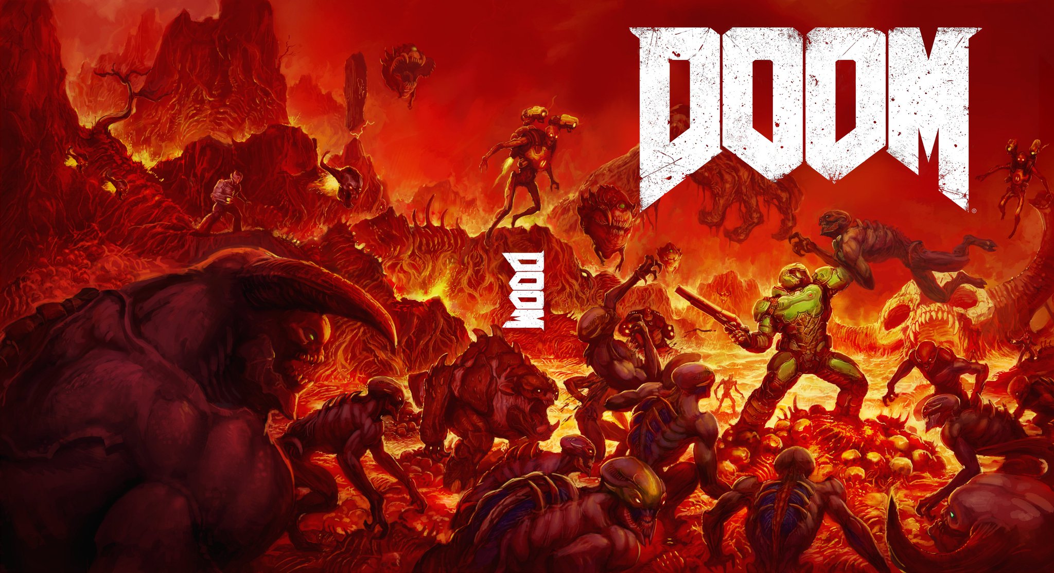
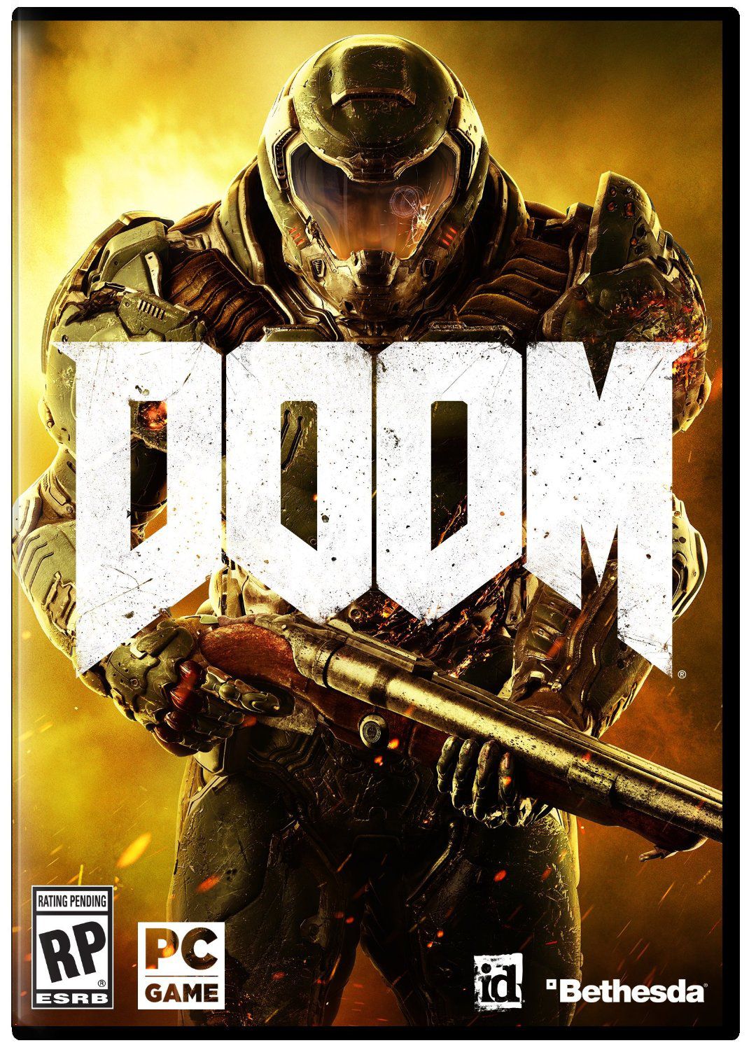
I mean, I didn't think the original was terrible. (If anyone can pull off generic doomguy cover its Doom...).


That said, those both look glorious. I am surprised they did not go with the second one as the default, since it mirrors the Iconic original.
 
Game is gonna be incredible
vV4mtFs.gif
 
Reverse sleeves? These should be the main sleeves. Don't listen to whatever marketing person told you to go with. These options are infinitely better.
 
I genuinely have no idea which one to vote for. The black makes for a better cover but I love the homage cover as well. I thought it was really cool when they said to me on Twitter that this could be a possibility and they're actually following through with it.
 
How about just changing option B as the cover art and option A as the changeable cover art?

The original currently original cover is extremely awful, nobody is interested in that.
 
Why aren't either of those the normal cover!? Option B would have been amazing and instead they pick Space Man in urine land?
 
Option A - should become the reverse sleeve
Option B - should become the actual cover art
Current Cover - throw it away
 
Both are really good and both are infinitely better than the default one they're going with. How the fuck are they going with their default one when they got these?
 
If they don't change the steelbook to either A or B, I'm cancelling the limited edition and getting regular lol
 
I'm not even gonna buy the game but option B is beautiful.

Man I wish Video game boxart was treated more like music album cover art. As creative as can be and actually encourages coming up with interesting boxart.
 
Yeah they should make a the official an b the reversible. Or atleat one of the two steelbooks from one of these cover. They are awesome.
 
I can only assume that Zenimax were behind the cover. How in the world could you not use both of these over that other POS?
 
So why don't they use one of these?
Why aren't either of those the normal cover!?


Market analysis/research likely determined the one they used has the best impact on generating a purchase. People need to remember here on NeoGAF we're a niche audience that has more invested into video games. There are people who don't stay current on games, who aren't familiar with old titles, and a boxart with generic Halo looking guy with gun may in fact better grab their attention, and their purchase.
 
Option A for front cover, Option B for back cover. Original cover can go in the traaaaaaaaash.


If you're trying to say that they're plagiraizing something, I gotta tell you that a satanistic goat head is pretty much public domain and can be found eeeeeeeeeeeeeeeverywhere.
In fact, take this Doom 2 screenshot:

If you're not trying to say that, then sorry. I didn't want to put words in your mouth.
 
Both alternative covers are indeed better than the default. That said, I prefer the black cover to the "throwback" one. It's reminiscent of Quake-era boxarts.
 
Surprised by the love for B but I'm probably biased against the new art style. A is fantastic though, and I'm glad they're listening. (about this, the colors, and hopefully more)

They should really be voting for which one of these is the front and which one is the back and throw the current design in the trash. Or sell it to literally any other FPS franchise to use instead.
 
B is just classic Doom, love it.

A is a bit more horror-y, more appropriate for a Doom 3-type game. Still a lot better than the actual cover art though.
 
Top Bottom