I just stumbled across this on another site, and thought that it's wonderfully clever:
The Dyslexie font can be downloaded here. Any dyslexics here who haven't heard of this might find it useful. (I am not dyslexic myself, but still like the style!) There's also another font that's been around since 2011 called OpenDyslexic.
Edit: It seems that unfortunately the evidence to distinguish it from other fonts in terms of helping dyslexics to read is still thin on the ground - thank you PetriP-TNT:
That's a shame. Still, perhaps there's an individual reading this who finds the font (or another like OpenDyslexic) helpful for them personally.
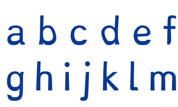
Developed by young Dutch designer Christian Boer, the Dyslexie typeface, currently on show at the Istanbul Design Biennial, has put all 26 letters of the alphabet through a finely-tuned process of adjustment to weigh them down and make it harder for similar letters to be confused.
“When they’re reading, people with dyslexia often unconsciously switch, rotate and mirror letters in their minds,” says Boer, who is dyslexic himself. “Traditional typefaces make this worse, because they base some letter designs on others, inadvertently creating ‘twin letters’ for people with dyslexia.”
To counteract this tendency, Boer has introduced a number of tweaks. First, the letters are weighted towards the bottom, as if the bulk of each character’s body has slumped downwards under accelerated gravitational pressure. This sets a heavy baseline, which makes it harder for the letters to be flipped upside down – and gives the font the look of a chubby-ankled cousin of Comic Sans.
This lowered centre of gravity is joined by specific alterations to differentiate similar letters. In many fonts, the d is the same as a b is the same as a p is the same as a q – a simple hoop on a stick, variously mirrored and rotated to form four different characters. Boer’s typeface distorts each letter, slanting the extenders and descenders and enlarging the openings to make them harder to confuse, in a process of careful anatomical refinement.
Other similar looking letters are given different heights and their proportions slightly deformed. The valleys of the v, w and y are all set at subtly different levels, while the c is prised open more than usual to make it less similar to an o. Elsewhere, tails are lengthened and the space between letters is increased to counteract the common crowding effect, while capital letters and punctuation are bolded, making it easier to spot where one sentence ends and a new one begins.
The Dyslexie font can be downloaded here. Any dyslexics here who haven't heard of this might find it useful. (I am not dyslexic myself, but still like the style!) There's also another font that's been around since 2011 called OpenDyslexic.
Edit: It seems that unfortunately the evidence to distinguish it from other fonts in terms of helping dyslexics to read is still thin on the ground - thank you PetriP-TNT:
There's no proof that Dyslexie would improve reading speed or comprehension in any way (for people suffering from dyslexia)
(See http://ux.stackexchange.com/questions/72290/what-is-the-most-dyslexia-friendly-font for additional reading)
That's a shame. Still, perhaps there's an individual reading this who finds the font (or another like OpenDyslexic) helpful for them personally.